In Part 01, we looked into the hello-world example. In this part, we will be working further on the Mail Client.
Observations
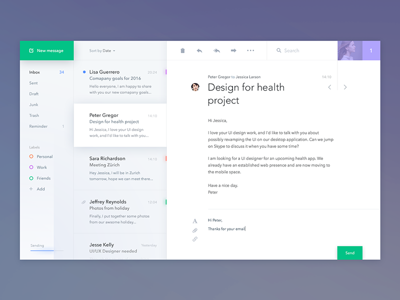
Here are the various observations by looking at the Mail Client:
-
We have three sections on the page. The first section displays the folders and email labels, the second sections displays the mails in that folder and third section displays the actual mail content.
-
Each of these sections have a header. And then the content associated with it.
-
There is no mobile or tablet layout, so we wont be worrying about the responsive layouts.
-
To keep the demo simple, we will be using data from a json file instead of actual data for the email.
-
We will be able to see emails from different people, but to keep the demo not depend on any other backend services, all the other buttons wont have any functionality associated with it.
Components
We are going to use the bottom up approach to component development. In my experience, using a bottom up approach, forces components to be reusable, which is a good thing.
For the Part 02 of this series, we are going to create three components. These are as follows:
-
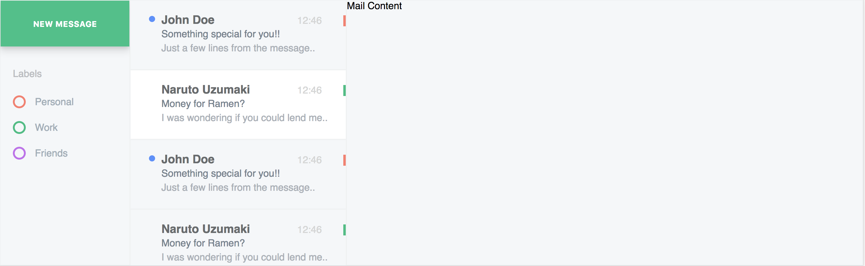
The new mail button
-
The mail information card
-
Email labels
1. New Mail Button
In this we are simply going to create a component that acts like a button, which is green in color, and contains some text.
Why is this a component? Because if you see the layout again, you will see that there is a green button with text "New Message" at the top, as well as a button with the text "Send" at the bottom. I decided to name this component as green-button.
Just like we did with the hello-world component, we will create two files green-button.tsx and green-button.css and place them in the /src/components/green-button folder.
2. Mail Information Card
The mail information card is the component which displays information about the sender, the subject, and the first line of the message.
Notice that there are a bunch of Mail Information Cards in the second column and you can only select one. This behaviour resembles that of a group of radio buttons, where you can select only one radio button at a time.
The Mail Information card has a label color associated with it as well. It also has a selected state which makes its background white. Keeping these things in mind, let’s create this component.
We will create two files mail-information-card.tsx and mail-information-card.css. And place them in /src/components/mail-information-card folder.
3. Email Labels
This component simply tells you what color represents what label. We can break it down into multiple components. One component can be the label itself called email-label and the other one can be the mail container where all these labels are called email-labels. Just like above, we are going the put the files in their respective folders.
email-label - the label
email-labels - the container
Conclusion
After making a bunch of changes to the app-home.tsx and app-home.css files, we can see it working on our demo. This is what it looks like with these three components:
If you are interested the full source code of the web app, here is the link to the github project: https://github.com/prateekjadhwani/my-pwa-02 or you can see a working demo of this project here: https://prateekjadhwani.github.io/my-pwa-02/
Upcoming in Part 03
In part 03 of this series, we will try to implement the remaining components so that we can use them freely in our web app.